Website Redesign Examples: What Good Looks Like (and Why)
Looking at real before-and-after redesigns tells you more about what works than any design theory. Here's what the best redesigns have in common — and what you can steal for your own site.
Introduction
There's a difference between knowing that your website needs a redesign and seeing what a good redesign actually looks like. Theory is easy. Execution is harder.
Looking at real redesigns — even when you can't see the exact company or brand — teaches you more about what actually works than any list of best practices. You see the patterns, the specific changes, and you start to understand why certain choices make such a big difference.
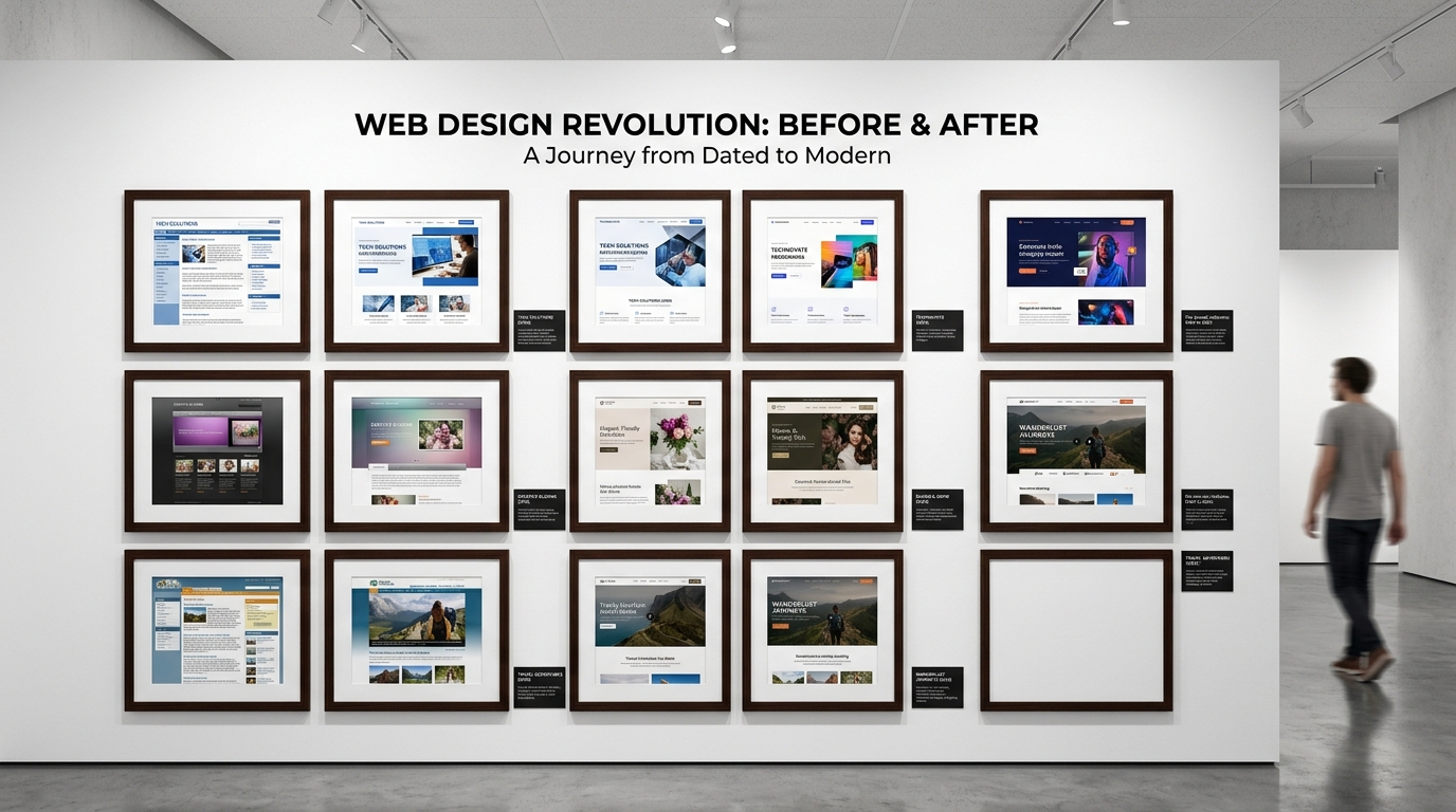
Here's a breakdown of the most common and impactful redesign patterns, with specific before-and-after examples to illustrate each one.
Pattern 1: The Typography Transformation
Before: Body text at 13–14px. Heading and body sizes too close together. Fonts like Open Sans or Helvetica Neue that read as "old default."
After: Body text at 17–18px. Clear size hierarchy between H1, H2, and body. Modern fonts like Inter, DM Sans, or Plus Jakarta Sans.
Why it matters: Typography is the single biggest contributor to whether a site "feels modern." Most visitors can't articulate why something looks dated — but they immediately sense it. Updating fonts and sizes alone can make a 2019 site look like 2026 without changing anything else.
The typical result: Reduced bounce rate (people stop and read instead of immediately leaving), longer time on page, and a stronger brand impression.
Pattern 2: The Whitespace Rescue
Before: Sections packed tight. 20px padding around everything. Content blocks fighting for attention with no breathing room. Feels claustrophobic.
After: Sections spaced 80–120px apart. Content blocks have generous padding. Nothing feels rushed or cramped. The eye knows exactly where to look next.
Why it matters: Whitespace is the most underestimated design element. It doesn't feel like anything is "added" — but the perception of quality, clarity, and professionalism goes up dramatically.
The typical result: Clearer reading path, stronger CTA prominence, and content that actually gets read instead of skimmed and abandoned.
The specific change: If I had to name one CSS change that makes the biggest visual impact, it's this:
/* Before */
.section { padding: 40px 20px; }

/* After */
.section { padding: 80px 20px; }
That doubling of vertical padding immediately makes a site feel more modern and premium.
Pattern 3: The Hero Section Overhaul
Before: Hero has a photo carousel with three slides. Headline is vague ("Solutions for your business"). Sub-headline explains nothing. Two buttons with similar styling fighting each other. CTA buried below a wall of text.
After: Single static hero image or background. Specific headline: "AI-generated website redesigns in minutes." One short supporting sentence. One clear CTA button with strong contrast. Nothing else.
Why it matters: Carousels are conversion killers. Multiple studies have shown that they reduce engagement compared to a single strong hero. Visitors don't wait for the second slide — they bounce or scroll past.
The specific result: In documented case studies, removing carousels and replacing with a single focused hero consistently increases homepage conversion rate by 10–30%.
Pattern 4: The Mobile Rebuild
Before: A desktop site that's technically "responsive" — the layout collapses into a single column but nothing is actually optimized for mobile. Text is too small. Buttons require precise tapping. Navigation requires a tap, then a long dropdown menu, then another tap.
After: Layout genuinely redesigned for mobile. Large tap targets. Navigation simplified to a clean hamburger menu with 4–5 main options. Hero headline visible without scrolling. CTA button full-width for easy tapping.
Why it matters: "Mobile-friendly" and "mobile-optimized" are not the same thing. A technically responsive site still provides a poor experience when designed from a desktop-first perspective.
The specific result: Mobile conversion rates often improve 40–80% after a proper mobile-first redesign. This has outsized impact because mobile traffic is typically 60–70% of total visits.
Pattern 5: The Homepage Clarity Fix
Before: Homepage opens with a generic banner image. Headline is a company tagline that doesn't explain what the company does. Navigation has 9 items. Visitors have to scroll significantly before understanding if this company is relevant to them.
After: Homepage opens with an immediate value proposition. "We help [specific audience] achieve [specific outcome]." Navigation reduced to 5 items. Scroll reveals social proof, then a clear explanation of what's offered, then a strong CTA.
Why it matters: Visitors decide whether to stay on your page in about 50 milliseconds. If the value proposition isn't immediately clear, they leave. Clarity beats beauty every time.
The typical result: Bounce rate drops, time on site increases, and lead form submissions go up — often by 20–40% — when the homepage message is sharpened.
Pattern 6: The Social Proof Upgrade
Before: A testimonials section buried at the bottom of the page. Generic quotes like "They did a great job!" with no last name, no company, no specific result.
After: Reviews visible near the top of the page. Testimonials with full name, title, company, and specific result ("Increased our booking rate by 35% in 6 weeks"). Client logos from recognizable companies. Star rating bar from Google or Trustpilot.
Why it matters: Social proof is most powerful at the moment of decision — not after someone has already read everything and is about to leave. Moving strong testimonials higher on the page consistently improves conversion rates.
The specific result: This is one of the most documented conversion improvements in CRO literature. Specific, named testimonials near decision points typically improve conversion rate by 15–40%.
Pattern 7: The Speed Overhaul
Before: Page takes 6–8 seconds to load on mobile. PageSpeed mobile score of 35. LCP (Largest Contentful Paint) of 8 seconds. Multiple uncompressed images weighing 3–5MB each. 15 JavaScript plugins loading in the header.
After: Page loads in under 2 seconds. PageSpeed mobile score of 92. LCP under 2.5 seconds. Images compressed to under 200KB each in WebP format. Non-essential scripts loaded asynchronously.
Why it matters: Every second of load time reduces conversion rate by approximately 7%. A site that was loading in 8 seconds and improved to 2 seconds recovers roughly 42% in conversion rate just from speed improvements.
The typical result: Faster sites rank better in search results and convert better. Speed improvement is simultaneously an SEO play and a CRO play.
What the Best Redesigns Have in Common
Looking across hundreds of website redesigns, the high-impact ones share these traits:
They started with a specific goal. Not "make it look better" but "improve mobile conversion rate" or "reduce bounce rate on our pricing page." The goal informed every decision.
They protected what was working. High-traffic pages kept their URLs. Converting headlines were preserved. The team knew what not to change.
They simplified before adding. More whitespace, fewer navigation items, one CTA instead of five. The instinct to add more is usually wrong.
They prioritized mobile. Not as an afterthought, but as the primary design surface.
They measured the result. Redesigns without before-and-after metrics can't be evaluated. The best teams tracked conversion rate, bounce rate, and organic traffic for at least 30 days after launch.
The Fastest Way to See Your Own Before-and-After
You don't need to wait for a full redesign to see what a modernized version of your site looks like.
Paste your URL into Redesignr and the AI generates a before-and-after comparison in minutes. You'll see your current design next to a version built on 2026 standards — updated typography, spacing, color, and mobile layout.
It's the fastest way to turn "I know my site needs work" into "I can see exactly what different looks like."
Conclusion
The most effective redesigns aren't the most creative ones — they're the most focused ones. Clear goal. Specific changes. Measured results.
The patterns above appear across redesigns in virtually every industry because they're grounded in how people actually browse and make decisions online. Typography, whitespace, clarity, social proof, mobile, and speed. Get these right and the results show up in your metrics.
Redesign websites with Redesignr.io
Paste any URL and get a modern, deploy-ready TailwindCSS redesign in 2 minutes. Free to preview.
